| Feature | Responsive Web Design | Adaptive Web Design |
| Definition | Responsive design automatically adjusts layout based on screen size using flexible grids and CSS media queries. | Adaptive design uses multiple fixed layouts designed for specific screen sizes. |
| Flexibility | Very flexible — works on any screen size | Less flexible — designed for specific devices only |
| Layout | One fluid layout that changes dynamically | Multiple static layouts (e.g., for mobile, tablet, desktop) |
| Technology | Uses CSS media queries, flexible grids, percentages | Uses predefined breakpoints and separate layouts |
| Development | Easier to maintain (one version of the site) | More complex (multiple versions needed) |
Responsive Web Design
This example shows how the layout changes from horizontal to vertical on smaller screens.
<!DOCTYPE html>
<html>
<head>
    <style>
        body {
            font-family: Arial;
        }

        .container {
            display: flex;
            flex-direction: row;
        }

        .box {
            flex: 1;
            padding: 20px;
            background-color: lightblue;
            margin: 10px;
            text-align: center;
        }

        /* Mobile view */
        @media (max-width: 768px) {
            .container {
                flex-direction: column;
            }
        }
    </style>
</head>
<body>

<div class="container">
    <div class="box">Block 1</div>
    <div class="box">Block 2</div>
    <div class="box">Block 3</div>
</div>

</body>
</html>Adaptive Web Design
This example uses specific breakpoints and fixed widths for different devices.
<!DOCTYPE html>
<html>
<head>
    <style>
        body {
            font-family: Arial;
        }

        .container {
            width: 960px;
            margin: auto;
        }

        /* Tablet layout */
        @media (max-width: 1024px) {
            .container {
                width: 700px;
            }
        }

        /* Mobile layout */
        @media (max-width: 600px) {
            .container {
                width: 100%;
                background-color: lightgray;
            }
        }
    </style>
</head>
<body>

<div class="container">
    <h1>Adaptive Layout Example</h1>
    <p>This layout changes based on fixed screen sizes.</p>
</div>

</body>
</html>My opinion wich is better
Responsive web design is better, it is more flexible because it works on any screen size, not just specific devices.
Adaptive design can be useful in some cases, especially when performance is important, but it requires more work and is less flexible.
My Site with adaptive design:
Link
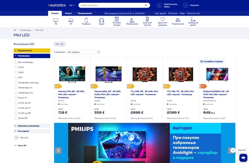
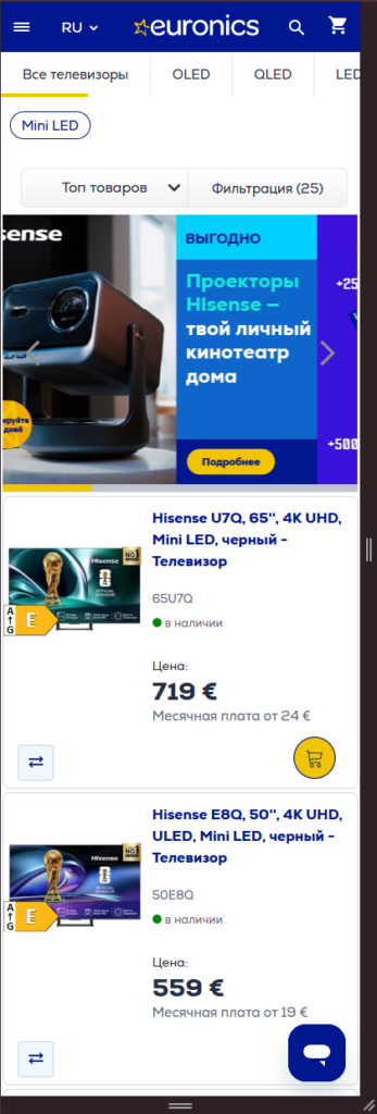
Test on the other site (Euronics)
Mobile:
The menu on the phone has become much narrower, and the filter menu has been hidden
Tablet and pc are the same: